 HTML5+CSS3构建同页面表单间的动画.docx
- 文档编号:774112
- 上传时间:2023-04-30
- 格式:DOCX
- 页数:16
- 大小:42.05KB
HTML5+CSS3构建同页面表单间的动画.docx
《HTML5+CSS3构建同页面表单间的动画.docx》由会员分享,可在线阅读,更多相关《HTML5+CSS3构建同页面表单间的动画.docx(16页珍藏版)》请在冰点文库上搜索。
HTML5+CSS3构建同页面表单间的动画
HTML5+CSS3构建同页面表单间的动画切换
【CSDN编译】导读:
有开发者表示,HTML5将给个人开发者带来更多机遇。
下面的稿件详细描述了一个唯美的动画效果,它实现了在同一个页面中进行登录表单和注册表单的转换。
这些效果,完全由HTML5和CSS3实现。
文章后面附上了三种不同风格的显示转换效果、以及源码下载。
既可为网页瘦身,又可实现漂亮的网页效果,快快收藏吧。
这篇稿件将描述如何在HTML5中,使用CSS3的目标伪类“:
target”来创建注册和登录两个表单、并实现它们在同一个页面中的显示转换。
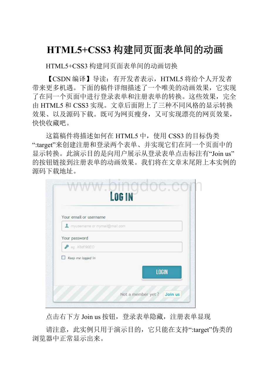
此演示目的是向用户展示从登录表单点击标注有“Joinus”的按钮链接到注册表单的动画效果。
我们将在文章末尾附上本实例的源码下载地址。
点击右下方Joinus按钮,登录表单隐藏,注册表单显现
请注意,此实例只用于演示目的,它只能在支持“:
target”伪类的浏览器中正常显示出来。
HTML部分
在HTML中定义有两个表单,其中一个表单已用CSS隐藏使之不可见。
来看看代码:
1
2
--hiddenanchortostopjump-->
3
4
5
6
7
8
Login
9
10
11
12
13
14
15 90EO"/> 16
17
18
19
20
21
22
23
24
25Notamemberyet?
26
27
28
29
30
31
32
33
Signup
34
35
36
37
38
39
40
41
42
43
44 90EO"/> 45
46
47
48 90EO"/> 49
50
51
52
53
54Alreadyamember?
55
56
57
58
59
60
61
可以看到在上面的代码中,使用了一些HTML5不错的新功能。
比如在inputtype方面,实现密码自动隐藏用户键入点替换(当然这取决于浏览器是否支持)。
用浏览器检查输入类型的电子邮件是否是正确格式等。
有两个环节要记住。
你可能已经注意到表单项部的两个
当我们点击并触发目标伪类时,我们就能通过“锚”标记(HTML中一种跳转定位方式,一般用于长网页)在原网页中跳到合适的位置,而不用另打开一个新网页。
第二个动作与所用图标、字体相关。
我们为显示的图标使用一个数据属性。
在HTML中通过设置“icon_character”,就可以选择一个CSS来控制所有的图标风格样式。
(这里对于锚标记的使用可能会有些糊涂,但看到后面就会明白了。
)
CSS部分
这里将会出现一些CSS3的技巧代码,请注意,可能有的浏览器目前还不支持CSS3而无法正常显示。
两个CSS定义。
(后面会说明为什么要定义两个CSS的原因。
)
首先,为需要显示的区域定义一个外观。
62#subscribe,
63#login{
64position:
absolute;
65top:
0px;
66width:
88%;
67padding:
18px6%60px6%;
68margin:
0035px0;
69background:
rgb(247,247,247);
70border:
1pxsolidrgba(147,184,189,0.8);
71box-shadow:
720pt2px5pxrgba(105,108,109,0.7),
730px0px8px5pxrgba(208,223,226,0.4)inset;
74border-radius:
5px;
75}
76#login{
77z-index:
22;
78}
这里定义了投影,以及如文章开始的那张图上所示的蓝色辉光。
并赋值z-index为22。
下面是关于背景图片样式的代码:
79/****generaltextstyling****/
80#wrapperh1{
81font-size:
48px;
82color:
rgb(6,106,117);
83padding:
2px010px0;
84font-family:
'FranchiseRegular','ArialNarrow',Arial,sans-serif;
85font-weight:
bold;
86text-align:
center;
87padding-bottom:
30px;
88}
89
90/**Forthemomentonlywebkitsupportsthebackground-clip:
text;*/
91#wrapperh1{
92background:
93-webkit-repeating-linear-gradient(-45deg,
94rgb(18,83,93),
95rgb(18,83,93)20px,
96rgb(64,111,118)20px,
97rgb(64,111,118)40px,
98rgb(18,83,93)40px);
99-webkit-text-fill-color:
transparent;
100-webkit-background-clip:
text;
101}
102
103#wrapperh1:
after{
104content:
'';
105display:
block;
106width:
100%;
107height:
2px;
108margin-top:
10px;
109background:
110linear-gradient(left,
111rgba(147,184,189,0)0%,
112rgba(147,184,189,0.8)20%,
113rgba(147,184,189,1)53%,
114rgba(147,184,189,0.8)79%,
115rgba(147,184,189,0)100%);
116}
注意,由于目前只有WebKit浏览器支持background-clip:
text,为了在适应不同浏览器,还要创建一个H1标题样式:
带条纹背景的文本样式。
由于background-clip:
text只适用于WebKit,所以这里用WebKit作前缀,这也是为什么要把CSS分成两部分,并只使用来定义的原因。
用WebKit作前缀是不太好的做法,仅用于这种演示示例。
现在,WebKit的文本颜色透明度属性可以派上用场了:
它可以实现透明效果的背景样式。
表单上,标题下方那条水平线的样式也由一个after伪类控制。
这里使用了一个2px的高度和两边淡出的效果。
现在,接着进行样式定义。
117/****advancedinputstyling****/
118/*placeholder*/
119:
:
-webkit-input-placeholder{
120color:
rgb(190,188,188);
121font-style:
italic;
122}
123input:
-moz-placeholder,
124textarea:
-moz-placeholder{
125color:
rgb(190,188,188);
126font-style:
italic;
127}
128input{
129outline:
none;
130}
为输入样式定义outline属性,以便用户能迅速输入正确信息。
如果你不打算定义outline,那也应该使用:
active和:
focus来定义这些输入样式的状态。
131/*alltheinputexceptsubmitandcheckbox*/
132#wrapperinput:
not([type="checkbox"]){
133width:
92%;
134margin-top:
4px;
135padding:
10px5px10px32px;
136border:
1pxsolidrgb(178,178,178);
137box-sizing:
content-box;
138border-radius:
3px;
139box-shadow:
0px1px4px0pxrgba(168,168,168,0.6)inset;
140transition:
all0.2slinear;
141}
142#wrapperinput:
not([type="checkbox"]):
active,
143#wrapperinput:
not([type="checkbox"]):
focus{
144border:
1pxsolidrgba(91,90,90,0.7);
145background:
rgba(238,236,240,0.2);
146box-shadow:
0px1px4px0pxrgba(168,168,168,0.9)inset;
147}
这里我们并不全是用伪类去定义输入样式,除了checkbox。
因为删除了outline属性,所以这里使用了a:
focus和:
active状态定义。
自从不再为输入样式使用:
before和:
after伪类后,就使用图标的label标签进行设置。
这里使用了fontomas库中的一些漂亮图标。
还记得data-icon的属性吗?
要把信息传递到正确的地方。
这里使用data-icon=’u’来表示用户,‘e’表示email,‘p’表示密码。
一旦确定的信件,下载字体,用fontsquirrel字体引擎将这些信息转换成@font-face兼容格式。
148@font-face{
149font-family:
'FontomasCustomRegular';
150src:
url('fonts/fontomas-webfont.eot');
151src:
url('fonts/fontomas-webfont.eot?
#iefix')format('embedded-opentype'),
152url('fonts/fontomas-webfont.woff')format('woff'),
153url('fonts/fontomas-webfont.ttf')format('truetype'),
154url('fonts/fontomas-webfont.svg#FontomasCustomRegular')format('svg');
155font-weight:
normal;
156font-style:
normal;
157}
158
159/**themagicicontrick!
**/
160[data-icon]:
after{
161content:
attr(data-icon);
162font-family:
'FontomasCustomRegular';
163color:
rgb(106,159,171);
164position:
absolute;
165left:
10px;
166top:
35px;
167width:
30px;
168}
不用为每个图标指定一个类,而是使用content:
attr(data-icon)来检查data-icon属性信息。
所以只需要定义字体、颜色和位置。
现在,为两个表单中的提交按钮定义样式。
169/*stylingbothsubmitbuttons*/
170#wrapperp.buttoninput{
171width:
30%;
172cursor:
pointer;
173background:
rgb(61,157,179);
174padding:
8px5px;
175font-family:
'BebasNeueRegular','ArialNarrow',Arial,sans-serif;
176color:
#fff;
177font-size:
24px;
178border:
1pxsolidrgb(28,108,122);
179margin-bottom:
10px;
180text-shadow:
01px1pxrgba(0,0,0,0.5);
181border-radius:
3px;
182box-shadow:
1830px1px6px4pxrgba(0,0,0,0.07)inset,
1840px0px0px3pxrgb(254,254,254),
1850px5px3px3pxrgb(210,210,210);
186transition:
all0.2slinear;
187}
188#wrapperp.buttoninput:
hover{
189background:
rgb(74,179,198);
190}
191#wrapperp.buttoninput:
active,
192#wrapperp.buttoninput:
focus{
193background:
rgb(40,137,154);
194position:
relative;
195top:
1px;
196border:
1pxsolidrgb(12,76,87);
197box-shadow:
0px1px6px4pxrgba(0,0,0,0.2)inset;
198}
199p.login.button,
200p.signin.button{
201text-align:
right;
202margin:
5px0;
203}
这里是一个创建边框投影的技巧,你可以随意设置一条或多条边框投影。
这里使用lengthvalue来创建一个“假”的第二条边框,宽度为3px,无模糊效果。
接着定义复选框的样式:
204/*stylingthecheckbox"keepmeloggedin"*/
205.keeplogin{
206margin-top:
-5px;
207}
208.keeplogininput,
209.keeploginlabel{
210display:
inline-block;
211font-size:
12px;
212font-style:
italic;
213}
214.keeplogininput#loginkeeping{
215margin-right:
5px;
216}
217.keeploginlabel{
218width:
80%;
219}
为表单使用重复线性渐变的样式,以实现条纹背景效果。
220p.change_link{
221position:
absolute;
222color:
rgb(127,124,124);
223left:
0px;
224height:
20px;
225width:
440px;
226padding:
17px30px20px30px;
227font-size:
16px;
228text-align:
right;
229border-top:
1pxsolidrgb(219,229,232);
230border-radius:
005px5px;
231background:
rgb(225,234,235);
232background:
repeating-linear-gradient(-45deg,
233rgb(247,247,247),
234rgb(247,247,247)15px,
235rgb(225,234,235)15px,
236rgb(225,234,235)30px,
237rgb(247,247,247)30px
238);
239}
240#wrapperp.change_linka{
241display:
inline-block;
242font-weight:
bold;
243background:
rgb(247,248,241);
244padding:
2px6px;
245color:
rgb(29,162,193);
246margin-left:
10px;
247text-decoration:
none;
248border-radius:
4px;
249border


 建筑工程编制依据及概况.docx
